
Windows Logo history is a mystery for the common people. Everyone knows that the company changes the logo after every few years, but what is its history?
Nobody knows about it. We all know that Windows is the best operating system in the world.
All over the world is using Windows operating system without any doubt. Yes, there are some vulnerabilities, but the company is improving continuously, and in the future, they came up with new things.
In the last two decades, Windows is completely changing and become a part of life. People are not able to work without it.
Windows Logo is the sign of their success and hard work, and from the beginning to the till the day, they are evolving continuously.
Today we are going to know about the fun history of the Windows Logo. So read the whole article for fun facts and minor details. So let’s roll the intro.
Meaning of Windows Logo:
As we all know, that name is Window, so that the logo will be a four-paneled brand mark Window will be the perfect symbol.
The logo will modify with time and explain something new about the company and its work strategy.
The old logo had a classical perspective but with time company evolve by itself and also try to learn about customer expectations.
It will change the logo and explain that change is constant, and we all have to develop by ourselves while changing new things daily.
1985:
Microsoft was founded in 1975; during the starting year, the company was struggling to boost the business.
People are not easily accepting Windows and not so friendly with it, but in the mid 80’s the company is expanding their service because of their new MS-DOS or Disk Operating System, which was released in 1981.
After the launching of Graphical User Interface in 1985, the company becomes the necessity of every person.
They created their first logo with blue color, but the Windows are not equal. The design is good, and it shows the hard work of their people.
The first version is known as Windows 1.0 and 2.0. The logo is quite good and impresses all the people, but still, they are on the improving stage.
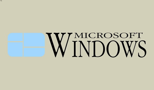
1989
During the early days, people are not so much used to computers, and they are mostly used from a business perspective, and very few companies can buy it.
So the next logo is a tribute to those who really work hard on their business and still work with these computers.
So the Windows logo is in black and white color and known as the Windows 2.0 version. The design is the experiment so the how people react because they can add colors later.
1992
This time Windows logo will be a little bit different and attractive. They keep the traditional look of the Windows logo and add the colors with the illusion format of moving.
Well, the color combination is quite interesting. The color combination depends on their products which they launch over all these years.
They launched versions Windows 3.1x, NT 3.1, And NT 3.5x. For almost a decade they used this logo, and it can be enjoyed in new computers also.
They keep the logo, keep the color, but the format of the logo is completely changed.
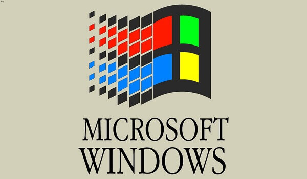
1994
Microsoft launched Windows 95 in 1994 with a graphical Windows logo. They create the illusion of a flag in the logo so the customers can imagine that it’s moving like a flag.
A new symbol of Microsoft, and explain that it will always evolve. It is the future of the next generation.
1998
At the end of the 90s, the brand came up with the following Microsoft version 98, which is quite popular and worked for many years after its next versions.
People are quite comfortable with Windows 98, and during this time, Computers are very much popular in schools and colleges.
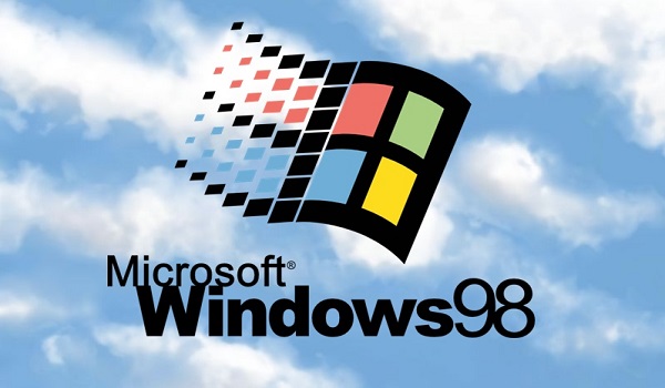
The new generation is going to learn something new in every country. With all these changes, the company also changes the logo’s fonts and makes it more attractive.
After all these Microsoft versions, Windows 98 is the most popular version that helps them to boost their company.
2001
The 2001 Windows logo design is quite decent, and remove the flag thing from it. Windows XP is also a success, and the colors are more bright with thin borderlines.
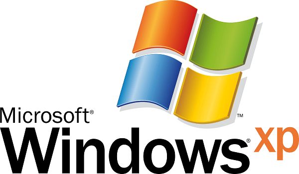
The windows logo is free from thick borderline, but we can see the shadows behind it. The colors are very much reciprocated.
2006
In 2006, Microsoft launched a new Windows logo in a round shape background and Windows design.
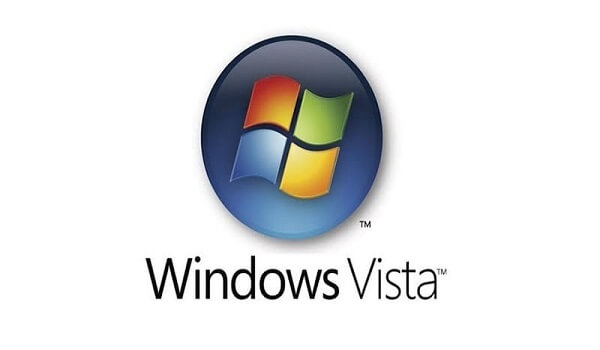
It gives the glass effect, and it is also known as “The Pearl. ” This is the last time that company uses four colors in the logo that represents different products of Microsoft.
The color Red stands for Office, green for XBOX, blue for Windows, and yellow for Bing.
2012
The 2006 design works for many years, we can say after Windows Vista, Windows 98 the favorite version that people like was Windows 2007 and 2003.
For many years, people love to use Windows 2003 or 2007, and many schools are using the same versions.
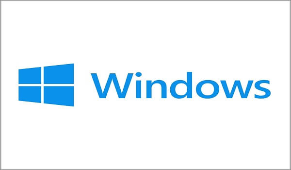
In 2012, Microsoft launched the new Windows logo with blue color only. This time all the barriers are removed, and everything is blue only. They change the angle of the windows logo.
2020
For many years they choose the same logo but keep experimenting, and finally, nowadays, people can see four different shades of blue in the Windows logo.

Conclusion
Many people don’t know that the Microsoft Window flag has many nicknames such as Windows key, Winkey, start key, logo key, flag key, super key, command key, or flag.
As time changes, the company changes there logos and technique of their work. We all know who is the owner of Microsoft, and we hope that they keep coming with new things that will make people’s lives easier and reasonable.