Hidden Messages in Logos is difficult but not impossible. The logo is very important for any website or company because it represents the company and tells the story behind it.
Yes, there are many logos of different companies that are famous, and very few people know about them.
If you’re a learner and excited about new things, read this article until the end because we cover many logos in this article. So let’s begin the journey.
Amazon
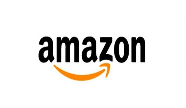
Did you ever notice the Amazon logo carefully? An arrow below the Amazon starts from the letter A and ends to the letter Z.
The arrow shows the smiley face, which represents the happiness of the customers and the arrow between the A to Z will represent the surety that they provide all the things to their customers.
Isn’t it great? They show their success through the logo, and very few people know about it.
FedEx

This is another amazing logo in the world. If you look at the logo distinctly, you found an arrow between the E and X, which depicts the speed and precision.
It is very popular all over the world, and it is also designed in Arabic way. In this way, the logo will be backward because the Arabic manuscript is read from right to left while English is read left to right.
Goodwill

We all know that sharing is caring, and helping people who have needs of things is a work of Goodwill.
So Goodwill creates a website where people can donate their stuff to other people, and they directly explain it through their logo.
The Goodwill logo shows a half-smiling face representing the smile of poor people, but it also makes G of the company name. Look it again, you will find it.
Baskin Robbins
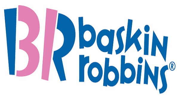
The most popular ice-cream chain all over the world. Yes, in many countries, it is less available, just like India.
But if you can see the logo, the B and R create so that it explains the total number of ice-cream flavors through their logo. Wow, this is real creativity, and people will love it.
LG
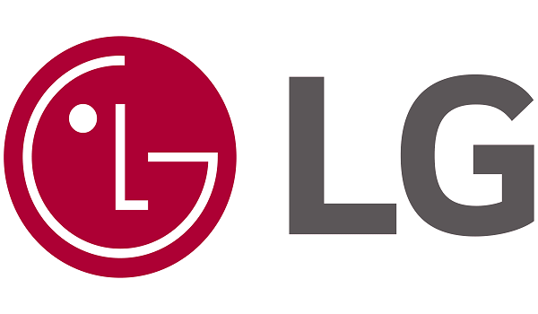
LG is a very big brand worldwide, and they change the logo so many times. It can easily see that there is a winking face of a person, but it also explains the letters L and G on this logo very smartly. Look it again.
Tostitos
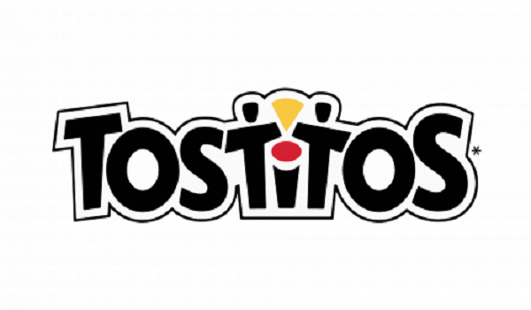
Do you like Tortilla chips? So definitely you go with Tostitos chips, they are very delicious and perfect for every party.
But did you ever notice the logo? Yes, here in the logo, you can see the tortilla chip icon between the two T, and there is a red dot above the letter I which represents sauce for a tortilla.
The logo shows the delicious tortilla chips and attracts customers, especially kids.
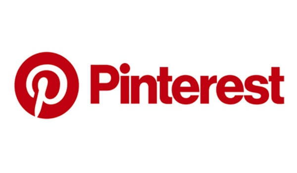
Everyone loves Pinterest because it always has new ideas that inspire bloggers just like us.
It also shows how many people are working and motivating the new generation. If you focus on the logo, it separates the logo like this “Pin-terest” differently.
You can see the letter P in the logo, and it is enough for presentation.
Le Tour de France

The sports lover knows about Le Tour de France; it is a bicycle race for men in France. Yes, it is very popular, but sportspeople only know about it.
Well, the logo is unique to this company. They designed the logo so creatively that letter “O,” “U,” and “R” represents the cyclist coming towards the yellow dot.
The yellow dot represents the sun of the new world which creates something new in the world. The letter O is a cycle vehicle, the U is the seat, and the R is the rider. It is creative.
Toyota
We all know about the wonderful cars of Toyota, but did you ever think that what the logo represents.
In all these years, the company changes the logo color many times and now settles in gray color.
But if you carefully see it properly, you can find out that the logo will spell the whole Toyota in a logo.
You can see the below image and check it out by yourself. The logo explains each letter of Toyota.
Hershey’s Kisses
It is a wonderful chocolate brand and working for many years and supply their chocolates in various countries.
The logo expresses the love of chocolate through a kiss. If you want an extra kiss, then check out Hershey’s Kisses logo.
Yes, the logo represents the love and kisses of chocolate lovers. So don’t miss it.
BMW

This is the most favorite brand of many people. The company also changed its logos many times, but very few people know about the meaning.
The BMW logo represents the propeller in motion. Yes, the blue part representing the sky, and the white part representing the propeller. It is a tribute to the company’s history in aviation.
Sony Vaio

Sony is a very old brand and very trustworthy. The Sony company used to work with TV and other things, but it became the Sony Vaio when they collaborate with technology.
VAIO means Visual Audio Intelligence Organizer. The logo represents analog and digital technology together.
The letters “V” and “A” represent the analog wave, and the letters “I” and “O” represent the binary digits. So they are saying that they are best in analog and digital as well.
Chick-Fil-A
The logo is very creative; it sells the tastier chicken to the people, and they represent it through their logo. You can check out the “C” letter; it makes the chicken in the logo.
Picasa

This is a prominent Google organizer logo. The design is very specific and creative because it explains the minimal message in it.
If you see the negative space in the logo, you can see the image of home. It is because of the word “CASA” in Spanish, which means home.
Picasa is the home for all the photos you edit. So there is the wonderful meaning behind the Picasa logo. Well, Picasa create the place in the list of hidden messages in logos.
Eighty20
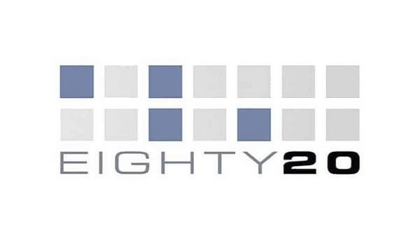
Eighty20 is quietly used for research purposes and gathers public data to make future marketing strategies and users’ requirements.
But if you focus on the logo, then it represents the binary digit 0 and 1. The blue color represents 1, and the grey color will be 0.
So the number will be like this 1010000, which represents eighty and 0010100, which represents 20.
MyFonts

Microsoft already offers many fonts in their library, but still, many people prefer a different kind of fonts, so in this case, they can go with this MyFonts.
The logo of MyFonts is unique because “MY” will be designed as a hand which means that people can use any font they want.
F1
The F1 logo is for Formula1 racing car company, and they have only 1 formula for winning: to work fast.
Yes, it represents their strategy in their logo F1. So don’t confuse and enjoy the racing, and don’t forget the formula.
Carrefour
In the French language, Carrefour means “Cross-roads,” and the logo represents the two arrows in different directions.
So the name and logo are similar. Many people don’t know the French language, so it is important to explain it carefully.
Facebook Places
Facebook Places is the new feature that Facebook launches. Facebook’s new geolocational product is in direct competition with the current leader in that area. So as the logo represents the 4 in a square.
Audi
It is the world’s largest automobile manufacturers in the world. In the logo, the circles are entitled, which means that they merge 4 companies to make it 1 and do the work together.
Well, it is a very amazing and interesting thing that I ever heard of it. Audi is the best example in the list of hidden messages in logos.
Milwaukee Brewers
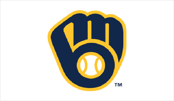
It is an American Baseball team, many players dreamt about working at this place. The logo explains that the catcher’s mitt is holding a ball, and if you look at it more carefully, you can find the letter M and B’s initials.
When it comes to the logo list, then how can we forget about Google? It is the place where we can find other hidden messages in logos lists.
We all are aware of Google’s history and how many times they change their logo style. But it is amazing to remember that they use the basic color RGB (Red, Green and Blue).
Yes, a yellow color is also there, representing many things like a warning for violation of the Google guidelines, green for people who are following the Google guidelines and Red for breaking the violation.
The Blue line can consider as new updates in Google; they always share it with people.
Conclusion:
Above, we mentioned the hidden messages in logos as very interesting, and many people don’t know about them.
The list is limited, and if you want, we must add more details about it, then contact us and let us know. We love to hear about it.

